

Styles & Inspiration
Controlling Color Harmony: Teal & Orange, Pastels, and Monochromes
Color conveys emotion instantly. Learn how complementary contrasts and saturation tuning define the mood of your artwork.
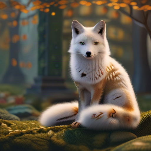
Color palettes determine how viewers perceive your artwork within fractions of a second. Combinations like "cinematic teal and warm amber color grading" evoke blockbuster grandeur, whereas "muted earth tones and desaturated sage green" convey intimacy and calm. Always define one dominant hue supported by a harmonious accent tone.